The program imports data in .csv format. It uses SQL SELECT command with two arguments, it asks the user if it is needed to group some of the data so it may use the COUNT and GROUP BY commands. After the new tables are created, it plots the data and prompts the user to give name to the plot and data.frame so they will be exported as jpeg and .csv respectively. At the end it asks if there are data that are not numeric so it plots a bar chart instead of line plot.
Program description
The main script is separated to multiple sub-function scripts. The structure of the main script is in levels. At first, main libraries that are going to be used are called. In this project two libraries are used. The first is the SQLDF library[1]. It allows the user to use SQL commands in order to manage data frames. The second library is ggplot2 [2]. Ggplot2 is, in my opinion, one of the easiest and well-structured libraries that exports graphic plots. Secondly, the main script asks user to import the .csv file and creates a data.frame.
Going to the second level of the program, the script prints the headers of the data that imported and asks the user to select the first SELECT argument (SQL command). Here, the script checks if the user inputs the correct data, otherwise it asks again for the user to import the data. At the end of the second level the next function is called.
At the third level, the program asks the user to select the data for the second SELECT argument and then calls for the next function that is used to plot the data.
At the fourth level, program asks the user if there are data that should be grouped in order to use the WHERE SQL function or not. If yes another script is called.
At the end, the program creates the data.frames that are going to be used in order to plot the data. It also asks the user if he wants to convert NAs to zeros or to remove them from the data. It also asks if there are any non-numeric data so it will use a bar chart. Finally, names given in order the created data and plot to be exported.
Problems
The main problem was the way I should use in order to pass the variables from one function to another. I preferred the write at global environment way [3]. There might be some other ways but I thought it was the best as I could use the variables to check the functions without restarting the whole script.
Another problem was the way that variables would pass in the SQL statements.
Also, there was a problem in the way to merge some data.frames. I would use SQL but OUTTER JOINT function is not supported in SQLDF library yet. There are many other ways to do this, though. One way is to use merge() function [4]. One other way is to use rbind.fill() [5] command of the plyr package [6]. Furthermore, there is also the melt() function [7] way of the reshape [8] package that can do this too. Finally, I desided to use an extended SQL command to get the same result.
At last, another main problem was the way that should be used in order to pass variables into the plot’s aesthetics. This was solved by using the aes_string() [9] instead of aes().
Examples
I will demonstrate some examples of this program.
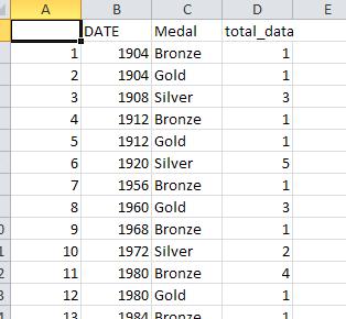
1) I imported a file [10] of the Olympic Games from 1900 to 2008. It has the names of the medalists, the country, type of medal (gold, silver, bronze), the year, the discipline, the season (summer games or winter) etc. I want to have a table exported of the games that Greece has won a medal the type of the medals won in these games, the year that it was, and how many medals of any type Greece won at any year.
The sql code that is used here is: SELECT DATE, Medal COUNT(Medal) where COUNTRY is GRE GROUP BY DATE, Medal ORDER BY DATE ASC
It produces my final table and it plots this table with an export like this:
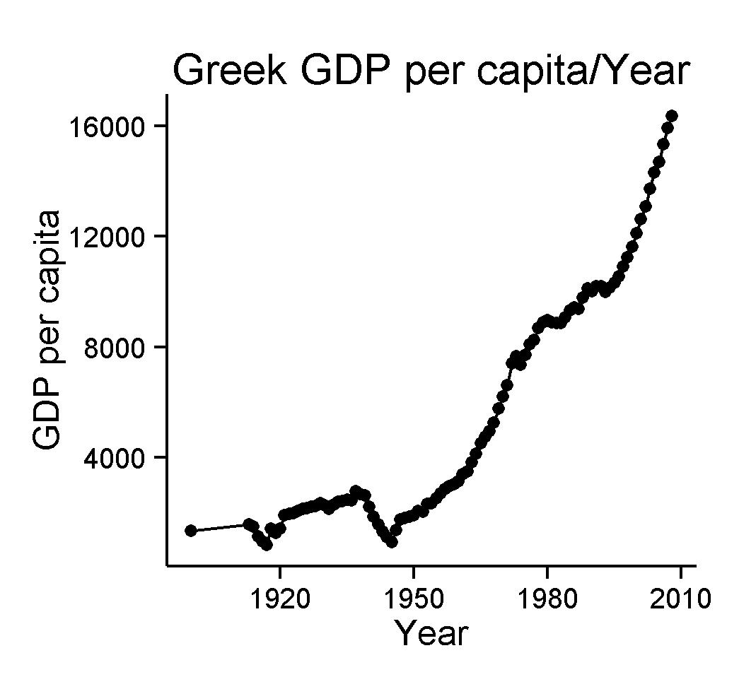
2) In the second example I have a .csv file that contains a list of years and some countries as headers, followed by their GDP per Capita in every year [11]. I import this and for the first data asked, I choose Year and then I select a country (here Greece). After this, I choose NO when it asks to group something (there is nothing to group here in this kind of data). It asks me which data I want to use as X axis and which as Y axis. I give the name of these axes and the plot name etc. The outcome is this:
References:
- SQLdf library for R Language: https://code.google.com/p/sqldf/
- GGplot2 library for R Language: http://www.ling.upenn.edu/~joseff/rstudy/summer2010_ggplot2_intro.html
- Writing at global environment: https://stat.ethz.ch/pipermail/r-help/2000-January/009790.html
- merge() function: http://anythingbutrbitrary.blogspot.gr/2012/08/manipulating-data-frames-using-sqldf.html , http://stackoverflow.com/questions/1299871/how-to-join-data-frames-in-r-inner-outer-left-right
- rbind.fill() function: http://stackoverflow.com/questions/13408378/rbind-fill-large-data-frames
- The plyr library: http://plyr.had.co.nz/ , http://cran.r-project.org/web/packages/plyr/plyr.pdf
- The melt() function: http://www.statmethods.net/management/reshape.html
- The reshape package: http://had.co.nz/reshape/
- aes_string: http://www.inside-r.org/packages/cran/ggplot2/docs/aes_string
- The Olympic Games data base: https://dl.dropboxusercontent.com/u/16725550/projects/Importing%20csv%20and%20SQL%20project/MedalsData.csv
- The GDP per Capita file used here: https://dl.dropboxusercontent.com/u/16725550/projects/Importing%20csv%20and%20SQL%20project/gdppercapita.csv
The code:
1) The basic script:
[code language=”r”]
sqlinr<-function(){
library("sqldf")
library("ggplot2")
print("Choose the data base you want to import")
filein<<-read.csv(file.choose())
##Choosing the first argument of the select statement
headerstable<<-as.data.frame(names(filein))
##provide the headers’ names. One should be selected for the select option
source("select1.r")
select1()
#source("plotfun2.r")
#plotfun2()
}
[/code]
2) The First function called:
[code language=”r”]
##FIRST SELECT ARGUMENT
select1<-function(){
print(data.frame(headerstable)) ##print the headers
colnumber<<-readline("Please type the number of the data you want \n this will give you the first column of the new frame: ")
if(is.na(as.numeric(colnumber))==FALSE & 1<=as.numeric(colnumber) & as.numeric(colnumber)<=nrow(headerstable))
{
source("select2.r")
select2()
}else{
Message <- paste("Input should be one of the column numbers.",
"Please enter a new value for 1st select argument", sep = "\n")
message(Message, appendLF=TRUE)
select1()
}
}
[/code]
3) The second function called:
[code language=”r”]
###SECOND SELECT ARGUMENT
select2<-function(){
##Choosing the second argument of the select statement
headerstable1<<-as.data.frame(names(filein))
##provide the headers’ names. One should be selected for the select option
print(data.frame(headerstable1)) ##print the headers
colnumber1<<-readline("Please type the number of the second column you want \n if something else typed, all the data will be selected \n this will give you the second column of the new frame: ")
##choose one header for the select opt.If non then select all (*).
if(is.na(as.numeric(colnumber1))==FALSE & 1<=as.numeric(colnumber1) & as.numeric(colnumber1)<=nrow(headerstable1))
{
#if((1<=as.numeric(colnumber1) & as.numeric(colnumber1)<=nrow(headerstable1)))
##Choosing the first argument of the WHERE statement
source("plotfun.r")
plotfun()
} else {
Message <- paste("Input should be one of the column numbers.",
"Please enter a new value for second select argument", sep = "\n")
message(Message, appendLF=TRUE)
select2()
}
}
[/code]
4) The third function called:
[code language=”r”]
plotfun<-function(){
kindofdata<-readline("if your data have to be grouped press y else press n : ")
if(as.character(kindofdata)=="y"){
source("where.r")
where()
selectstate<<-paste("select ",as.character(headerstable[colnumber,]),",",as.character(headerstable1[colnumber1,])," from filein where ",as.character(headerstable2[colnumber2,])," is ","’",extractinfo,"’",sep="")
finaldatatable<<-fn$sqldf("$selectstate")
##THE BEST ORDERED TABLE!!! select A as A,B as B, count(B) from table group by A,B order by A ASC
tabletoplot<-paste("select ",as.character(headerstable[colnumber,]),","
,as.character(headerstable1[colnumber1,]),",","count(",as.character(headerstable1[colnumber1,]),")",
" as total_data from finaldatatable group by ",as.character(headerstable1[colnumber1,]),",",as.character(headerstable[colnumber,]),
" order by ",as.character(headerstable[colnumber,])," ASC",sep="")
##super hard to paste so so so mamy lines!!!
finaltabletoplot<<-fn$sqldf("$tabletoplot")
print(as.data.frame(names(finaltabletoplot)))
choosexaxis<-readline("Choose the x axis to plot: ")
chooseyaxis<-readline("Choose the y axis to plot: ")
Seperatedata<-readline("Choose how data should be separated when plotted :")
xlabel<-readline("Name the x axis: ")
ylabel<-readline("Name the y axis: ")
title<-readline("Title your plot: ")
xname<-as.character(names(finaltabletoplot[as.numeric(choosexaxis)]))
yname<-as.character(names(finaltabletoplot[as.numeric(chooseyaxis)]))
sepdata<-as.character(names(finaltabletoplot[as.numeric(Seperatedata)]))
##Asking to remove NAs or replace them to zeros.
nareplace<-readline("To replace NAs to zeros press 0. To delete the NAs press 1: ")
if(as.character(nareplace)==0){finaltabletoplot[is.na(finaltabletoplot)]<-0
}
if(as.character(nareplace)==1){finaltabletoplot<-na.omit(fn$sqldf("$tabletoplot"))
}
##aes_string: lets you input variables as strings in the aes!!!Very very important
ggplot(data=finaltabletoplot,aes_string(x=xname, y=yname,color=sepdata))+
xlab(xlabel)+ylab(ylabel)+
ylim(min(finaltabletoplot[as.numeric(chooseyaxis)]),as.numeric(max(finaltabletoplot[as.numeric(chooseyaxis)])))+
ggtitle(title)+geom_point()+geom_line()+theme_bw() +
theme(
plot.background = element_blank()
,panel.grid.major = element_blank()
,panel.grid.minor = element_blank()
,panel.border = element_blank()
,panel.background = element_blank()
) +theme(axis.line = element_line(color = ‘black’))
}
if(as.character(kindofdata)=="n"){
selectstate<<-paste("select ",as.character(headerstable[colnumber,]),",",as.character(headerstable1[colnumber1,])," from filein")
finaldatatable<<-fn$sqldf("$selectstate")
##select A as A,B as B, from table
tabletoplot<<-paste("select ",as.character(headerstable[colnumber,]),","
,as.character(headerstable1[colnumber1,])
," from finaldatatable",sep="")
finaltabletoplot<<-fn$sqldf("$tabletoplot")
print(as.data.frame(names(finaltabletoplot)))
choosexaxis<-readline("Choose the x axis to plot(the number as shown): ")
chooseyaxis<-readline("Choose the y axis to plot (the number as shown): ")
xlabel<-readline("Name the x axis: ")
ylabel<-readline("Name the y axis: ")
title<-readline("Title your plot: ")
xname<-as.character(names(finaltabletoplot[as.numeric(choosexaxis)]))
yname<-as.character(names(finaltabletoplot[as.numeric(chooseyaxis)]))
numericdata<-readline("Please choose 1 if you have non numerical data you want to print.\n if all your data are numeric choose 2: ")
if(as.character(numericdata)==2){
##Asking to remove NAs or replace them to zeros.
nareplace<-readline("To replace NAs to zeros press 0. To delete the NAs press 1: ")
if(as.character(nareplace)==0){finaltabletoplot[is.na(finaltabletoplot)]<-0
}
if(as.character(nareplace)==1){finaltabletoplot<-na.omit(fn$sqldf("$tabletoplot"))
}
##For numerical data
##aes_string: lets you input variables as strings in the aes!!!Very very important
ggplot(data=finaltabletoplot,aes_string(x=xname, y=yname))+
xlab(xlabel)+ylab(ylabel)+
ylim(min(finaltabletoplot[as.numeric(chooseyaxis)]),as.numeric(max(finaltabletoplot[as.numeric(chooseyaxis)])))+
ggtitle(title)+geom_point()+geom_line()+theme_bw() +
theme(
plot.background = element_blank()
,panel.grid.major = element_blank()
,panel.grid.minor = element_blank()
,panel.border = element_blank()
,panel.background = element_blank()
) +theme(axis.line = element_line(color = ‘black’))
}
if(as.character(numericdata)==1){
##For non-numerical data
##stat="identity" lets you plot non numerical data.
ggplot(data=finaltabletoplot, aes_string(x=xname, y=yname)) + geom_bar(stat="identity")+
xlab(xlabel)+ylab(ylabel)+
ggtitle(title)+geom_point()+geom_line()+theme_bw() +
theme(
plot.background = element_blank()
,panel.grid.major = element_blank()
,panel.grid.minor = element_blank()
,panel.border = element_blank()
,panel.background = element_blank()
) +theme(axis.line = element_line(color = ‘black’))
}
}
tablesave<-readline("Please type the name that the final table is going to be saved: ")
write.csv(finaltabletoplot,file=paste(tablesave,".csv",sep=""))
plotname<-readline("Please type the name that the plot is going to be saved: ")
plotsave<-paste(plotname,".jpg",sep="")
ggsave(plotsave)
}
[/code]
5) The fourth function called:
[code language=”r”]
###WHERE ARGUMENT
where<-function(){
headerstable2<<-as.data.frame(names(filein))
print(data.frame(headerstable2))
colnumber2<<-readline("Please type the number of the column you want: ")
if(is.na(as.numeric(colnumber2))==FALSE & 1<=as.numeric(colnumber2) & as.numeric(colnumber2)<=nrow(headerstable2))
{
extractinfo<<-readline("please type the info you want to extract (as exactly written \n if else, it returns zero) :")
##exactly as it is written
}else {
Message <- paste("Input should be one of the column numbers.",
"Please enter a new value for the where argument", sep = "\n")
message(Message, appendLF=TRUE)
where()
}
}
[/code]


